How to Choose The Perfect Instagram Color Palette
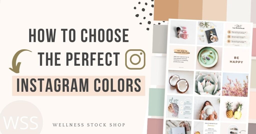
Committing to a combination of colors for your brand is essential to creating a cohesive Instagram feed. But if you don't have your branding colors yet, where do you start? And what's the best way to apply your new color palette to your feed?
Tag along, because I’ll share how to get started with choosing your perfect Instagram color palette and help you out with some tools to make the process easy. Plus, if you read till the end, there’s a surprise waiting for you! (spoiler alert - it’s free images!)
Find Your Perfect Color Palette
PRO TIP: If you don't have your branding colors yet, I recommend starting with just 2-3 Instagram colors. This makes things simple and you can always add more as you need.
If you're just starting out or DIY-ing your brand, here's a fun trick for finding the perfect colors... Pick your most popular image(s) and upload them to Canva’s color palette generator. The tool will auto-generate the most prominent colors from the image. This is a perfect way to get inspiration for creating your palette.
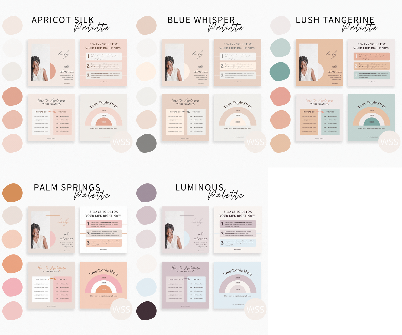
If you're a Wellness Stock Shop member, you can tap into the Creative Suite where you'll find dozens of designer-curated color palettes that are perfect for Instagram.
And because it can be a challenge to envision how a color palette will look in your feed, I've made it extra easy for you by including sample graphics with each palette so you don't have to guess how the colors will look once applied.
Types Of Color Schemes To Choose From
PRO TIP: Keep your audience in mind and what they're attracted to when choosing your color palette.
Here are some of the most standard color palette ideas that designers use when customizing branding colors. Checking out how designers use colors is the perfect way to inspire your Instagram color themes.
1. Analogous:
This color palette is created by choosing colors that are right next to each other on the color wheel, just like this example with maroon and blue. They mix together to create a new color - lavender. This can create a calm and serene feeling.

2. Monochromatic:
This palette uses one color, with multiple shades of that same color. It creates a beautiful soothing look. This is a very easy palette to use and to make your feed look beautiful.

3. Complimentary:
To create a color palette that pops, choose colors that are directly across from each other on the color wheel. This creates a more vibrant, energetic feeling. For instance:
- Red + Green
- Blue + Orange
- Purple + Yellow

3. Neutrals:
Neutral colors can perfectly complement any primary or secondary color you choose. They also keep things calm and spacious. (Psst! neutral color palettes are really popular on Instagram!)

If I have to choose my second favorite style for color schemes, it’s definitely this one! It’s super easy to style and add graphics to a feed in neutral colors because you can avoid the mismatch of colors without any effort.
Neutrals don’t demand much attention. They’re soft, soothing and - well - neutral. That means you don’t have to worry as much about your feed colors overpowering the colors in your images.
Grid Planning
PRO TIP: Perfect feeds can feel stale. Don't try to create perfection. Just create something that's really good, not perfect.
Once you have your colors, it's important to weave them consistently throughout your feed via your photos and graphics. It's important to refrain from using random photos that aren't consistent with your new look.
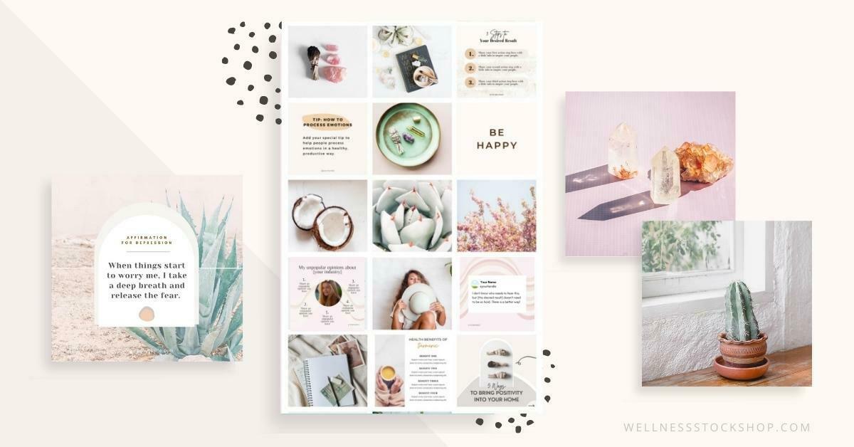
To be able to maintain your aesthetically pleasing Instagram feed, you need to make sure to find the right images. These should match your color scheme, your style, and your brand itself.
Instagram has changed a lot and these days it’s important to include educational and entertaining content such as graphs, lists and quotes in with your photos. Grabbing a collection of beautiful Canva templates is the best way to create content fast, which being able to change colors to stay aligned with your new aesthetic.
Keep in mind that not every photo you choose has to have your exact branding colors. However, it's helpful for some of your images to have at least some small hint of at least one of your brand colors. Most importantly, you want the images to fit the overall feeling of your feed. For instance, if your feed has a calm, soothing vibe - make sure every photo you post matches that vibe. Then, use customizable social templates to balance out your feed with your special branding colors.
Once you have all your images and social templates, that’s where the fun begins! (If you haven’t found pictures that speak to you, don’t worry, because if you’re looking for high-quality, natural-vibe stock photos for your wellness business, I got you!) So the fun starts with planning your grid – use Planoly or Later for easy planning – and if you haven’t decided on the layout yet, be sure to read my blog post on the 5 Instagram Grid Layouts for Maximum Engagement.
Now that you got clear on your style, you can be confident and start posting consistently. Consistency will help you drive people to your platform who will be interested enough to come back for more. Your brand can stand out from the others present on social media, you just have to maintain your cohesive and unique aesthetic.
BONUS: CLICK HERE to get your FREE Simple Social Planning Kit, ready-to-use for your refreshed Instagram feed!
100% Customizable Canva Templates
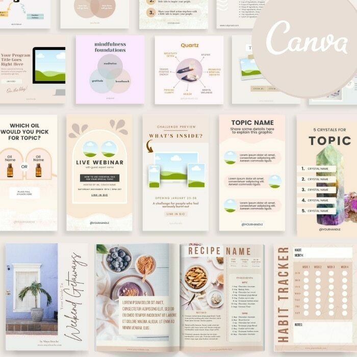
Get 100s of stunning Instagram, Pinterest, and Workbook templates to create gorgeous, professional content in minutes.
-
100% Customizable
-
Change colors, fonts, photos + text
-
Easy video tutorials
-
Free with membership
Explore Topics
Popular Posts
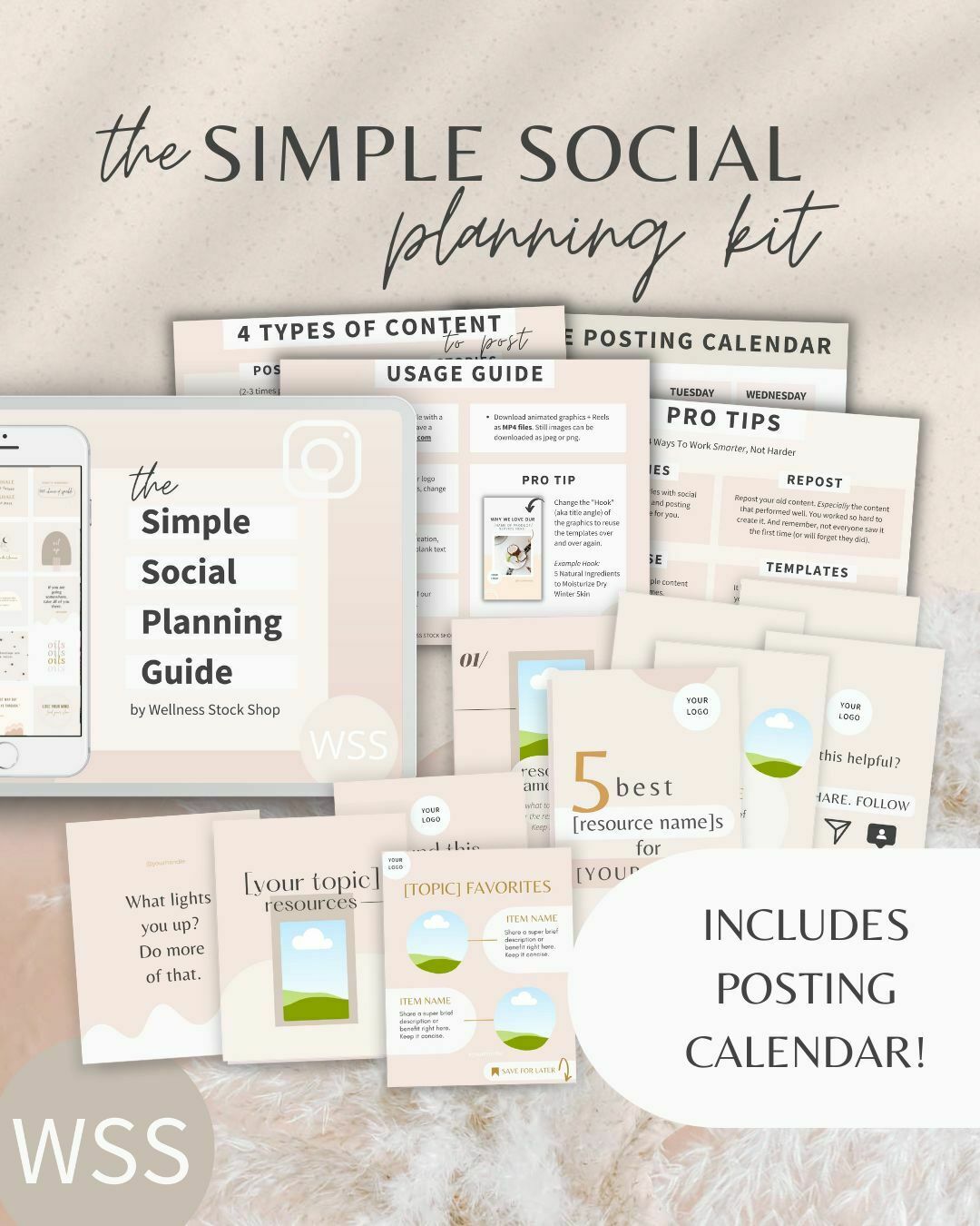
Get Your Free Simple Social Planning Kit
→ Posting calendar + guide, plus gorgeous templates (post, quote, carousel, story and reel bundle) to customize for your Instagram and beyond.

