How To Choose The Perfect Photos For Your Branding

Whether you're branding your services, a product, a movement, or yourself, choosing the right visuals is essential to help you captivate the right audience (you've got less than 3 seconds to make a lasting impression).
Quality intentional visuals speak to your audience, generate trust, reinforce your positioning in the market, and tell your potential buyers what they can expect from you when buying into your brand.
But with so many photo themes and styles to choose from… where do you even start?
Having previously defined the personality, and values for your brand is key to defining your signature style and should be essential to your branding strategy.
And, whether updating the visuals for your website, social media or current marketing project, here are a few tips to help you easily to choose the perfect photos for your branding.
1) REFLECT YOUR VIBE
No matter which unique personality (fun, quirky, disruptive, etc) you want to add to your brand in order to differentiate yourself in the market, bear in mind that at the end of the day… you are a purpose-driven brand.
You genuinely care and want to make a difference in the world.
Your photos should reflect the authenticity of your brand personality.
How? With visuals that reflect your natural, authentic vibe.
As a branding expert, I love to use stock photos from Wellness Stock Shop. The photos perfectly reflect that wholesome, soulful, feel-good vibe.
2) EXPRESS YOUR VALUES
What are the values your brand aligns with? Which values do you share with your ideal audience?
Think of your brand as a helping hand and an advocate for a specific cause that is aligned with your business and brand.
If you are selling products, you may want to get inspired by brands like the Body Shop or Dove.
Dove is a great example that keeps its verbal and visual identity well aligned.
Their brand defends “natural beauty”. Therefore, Dove aligns its messaging and products with “an authentic signature style”.
This is why the use of visuals that are clean looking portraying normal looking women from different cultural heritages, body shapes and ages.
Wellness Stock Shop offers the perfect feminine stock photos with diversity to reflect these values.
There is always a “reason why” in all decisions taken when expressing your brand essence.
If you are selling a service, think about the emotional heartfelt benefit that your clients experience after working with you.
Is it less stressful? More confident? Inner alignment? Connection? Better physical health?
Choose one emotional benefit and then brainstorm visual storytelling concepts that can reflect just that.
For example, better physical health leads to being more active and energetic. Therefore, if you're a fitness pro, you could align all your visuals to show some form of “active movement” and open-doors lifestyle.
What I love about Wellness Stock Shop is that it organizes the visuals by concepts and keywords.
Think of an emotional feeling or adjective for your brand, enter it into the search engine... and VOILA! Get some inspiration!
3) CHOOSE A SEASON TO STYLE YOUR BRAND
As you know, there are four main seasons. Each season has its own “color shades” and type of “natural light”.
If you don’t have a lot of experience with styling, don’t mix seasons. Choose one to help you keep your visuals cohesive and consistent. This will also help you reinforce a personality type and mood to easily choose your branding photos.
SPRING SEASON
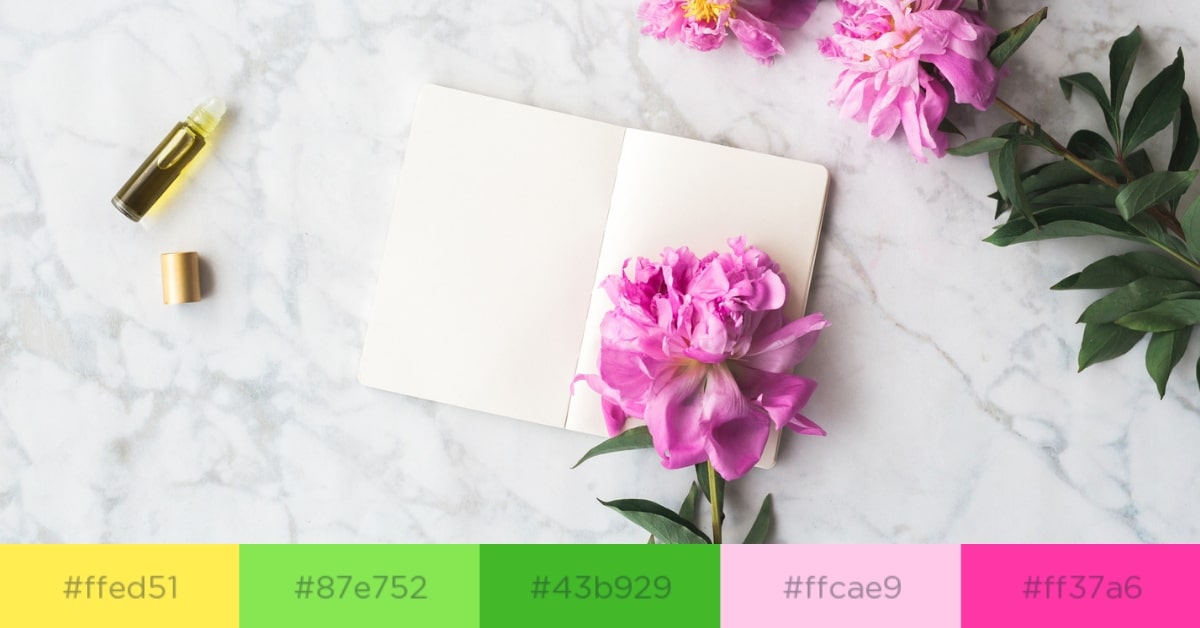
Photo by Wellness Stock Shop in the Journals + Self Care gallery
If your brand is optimistic, energetic, bubbly and highly approachable, then the spring season could be ideal. Think of sparkling, light, fresh and bright tones and color shades like bright yellows, wild rose, fresh kiwis.
SUMMER SEASON
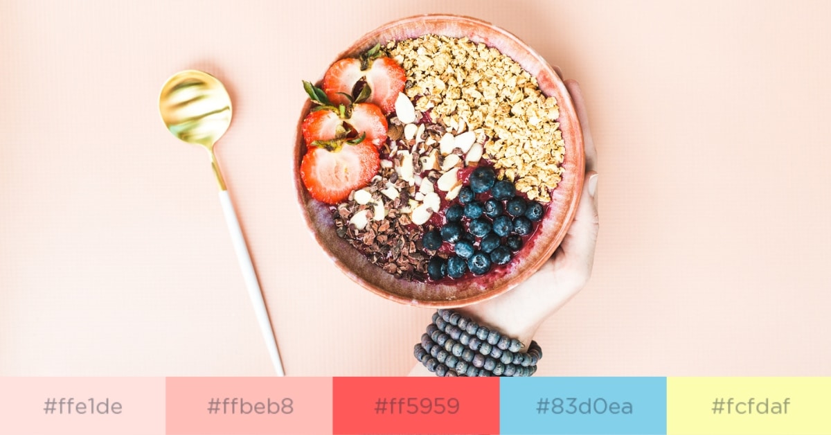
Photo by Wellness Stock Shop in the Prepared Foods gallery
Summer season is more romantic, dreamy, elegant, balanced, ethereal, soothing. Visual theme can be more delicate, soft with a muted tone. Think of misty rose, light coral, desert sand, juicy watermelon, Ibiza whites, sky blue, pale yellow.
AUTUMN SEASON
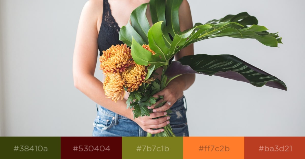
Photo by Wellness Stock Shop in the Botanica Femme gallery
Autumn is earthy, authentic, organic, strong, nostalgic, friendly, comforting. Colors are warmer, intense. Think of grays, copper red, pale golds, cinnamon satin, warm orange, dark pastel reds, dark scarlet, hunter greens.
WINTER SEASON
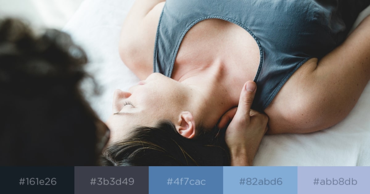
Photo by Wellness Stock Shop in the Massage gallery
Winter is cool, clear, self-assured, grounded, driven, more dramatic. Think of silvers, light steel blue, sparkling metallics.
It's a perfect season for a more luxurious brand allowing you to be more cutting edge. For example, using a minimalist approach with a strong emphasis on black and white.
4) IF IN DOUBT, KEEP IT SIMPLE
If you still have too many ideas think “less is always more”. Try not to use visuals that are “overly-dress up” with filters or extra decorative elements that add nothing to your overall messaging.
When you pick a photo ask yourself:
- Does this image transmit any form of caring, love and kindness?
- Is it aligned with my brand essence and promise?
- Would my client feel reassured when seeing this?
- Does it reflect the quality of my service and/or product?
- Does it bring up any feelings or emotions when seeing this photo?
- If I were my client and saw this visual for the first time… would it inspire me to find out more?

Ana H. Gilfedder is the founder of AsistUp - Branding partner for health and wellbeing.
Half Spanish, half Scottish living in Spain, Ana is a personality-driven brand strategist & stylist. She works with purpose-driven entrepreneurs and small biz owners who want to build a brand aligned with who they are.
A humanitarian, enthusiast about branding with archetypes, personal development and wellness. Ana helps her soulful clients start or improve their authentic brands so they can grow better.
Explore Topics
Popular Posts
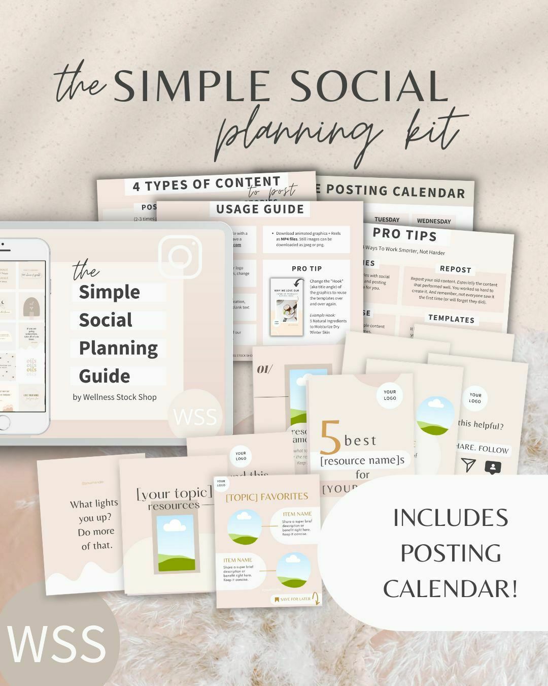
Get Your Free Simple Social Planning Kit
→ Posting calendar + guide, plus gorgeous templates (post, quote, carousel, story and reel bundle) to customize for your Instagram and beyond.

