How To Choose Your Brand Colors In Three Easy Steps
Struggling to choose the right brand colors for your wellness business?
It's no doubt that picking a quality color palette that embodies your brand personality is important for your biz.
Did you know that color increases brand recognition by 80%?
Plus, when faced with multiple product options, people make their purchase decisions based on color up to 85% of the time.
The right colors can be powerful.
But how do you know which colors are the right match for your brand?
You want colors that help your business stand out. Colors that connect with your ideal clients. And colors that fit beautifully together to give you a professional look. Right?
The good news?
There's not just one specific right color choice for your business. Many different colors could work.
But choosing colors without direction can be daunting.
That's why I'm so glad you're here, friend. I'm sharing my easy 3-step formula for choosing your perfect branding colors. I've created this color formula to keep your color choosing process as simple as possible.
The exercises in this 3-step process will help you avoid the overwhelm of choosing colors at random - and potentially repelling your ideal clients.
Instead, you'll get tips and guidance to help you choose colors intentionally, meaningfully, and in alignment with your unique wellness brand.
Step 1: Define Your Brand Personality
Colors are associated with emotions. They make you feel things. They set a mood.
When you define your brand's "personality" it's easier to find colors that match the right feeling you're trying to relay.
Not only this, but choosing colors to match your brand personality also helps to assure you're choosing colors with more intention and brand alignment.
Let's play a game. Match the color combination on the left with the best suitable brand personality on the right.
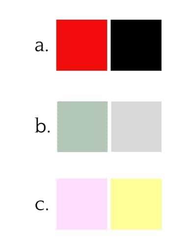
1. SOFT + SOOTHING
2. HAPPY + YOUTHFUL
3. BOLD + EMPOWERING
1. Soft + Soothing = B
2. Happy + Youthful = C
3. Bold + Empowering = A
Can you see how matching each color combination with any of the other "brand personalities" simply doesn't work? For instance, the red and black color combination (a) does not feel "soft and soothing", right?
It's time to define your brand personality.
To do this, just think of your brand as a person. And describe their most prominent characteristics - just like you would if your best friend asked "what are four things you love about me?"
Choose 4 descriptive words (example: friendly, calm, feminine, courageous):
1.
2.
3.
4.
PRO TIP: Often times, for a small business, the personality of your brand may reflect your own personality. Especially if you are the face of your business.
This brand personality encompasses every touch point you have with your clients.
Extra bonus - defining your brand personality will not only help you to choose your branding colors, but all your brand assets, including fonts and images.
Step 2: Choose Two Colors
Now it's time to choose your two main colors. You can choose more in the future, but I recommend starting here and keeping it simple.
The more colors you choose, the more complex and the harder to make your brand look professional. Plus, using fewer colors can make your brand more memorable.
In fact, 95% of top brands use only one to two branding colors.
Just think of some of the most recognized brands. Here's another game. Can you match the business on the left with their branding colors on the right?
1. IKEA
2. DHL
3. STARBUCKS
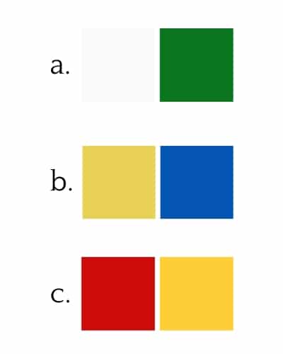
Answers:
- Ikea = B
- DHL = C
- Starbucks = A
Once you choose your colors, use them for a while to feel them out.
After using your colors in designs and different applications, you'll most likely get a feel for what you want to add. For instance, you might want to add some lighter colors to use as backgrounds. Or some darker, more contrasting colors that stand out. This is totally normal, but put that aside for now and stick with this simple palette to get you started.
Pairing colors is an art. And believe me, if you don't have a trained eye, it can be tricky to choose colors that fit together well. If you know you want to add more colors to your palette and want more guidance to assure your palette turns out looking professional, this is something I guide you through, step-by-step in my branding course.
When choosing your two colors, there are a few important things to keep in mind:
1. What message do you want to relay?
The brand personality exercise above will help. Plus, learning about the meaning of colors is important too.
2. Do you want your brand to be energetic or harmonious?
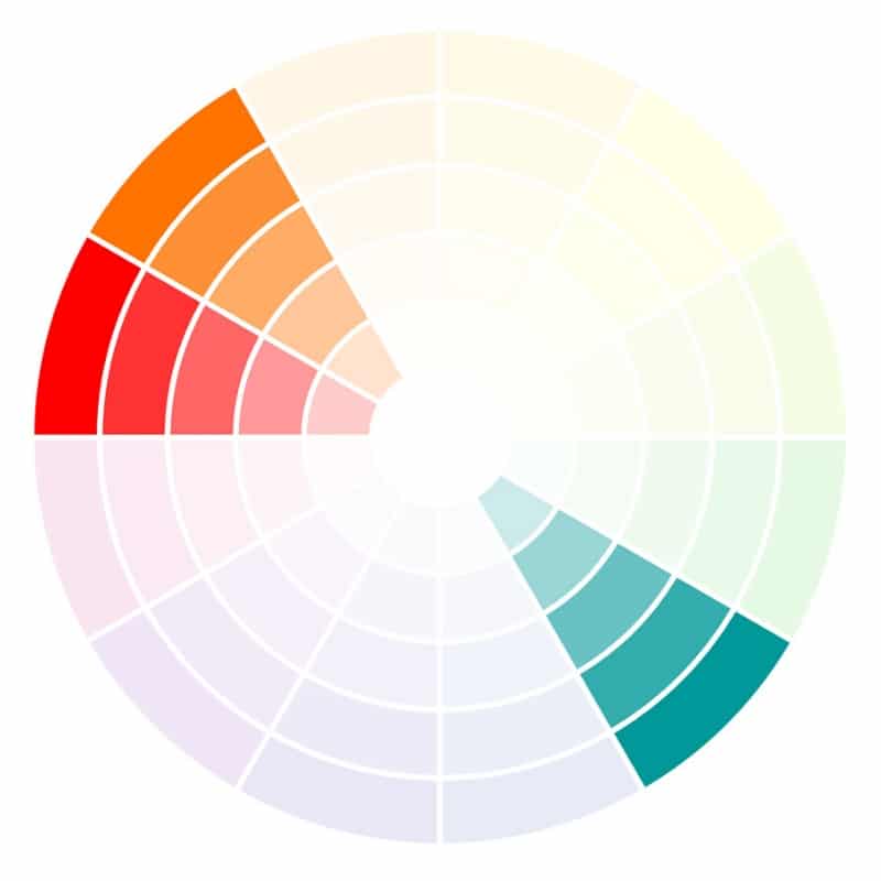
If you want it to be energetic, choose colors located on opposite sides of the color wheel. This creates a more dynamic look. If you'd like to create more harmony, choose similar colors that sit near each other on the color wheel.
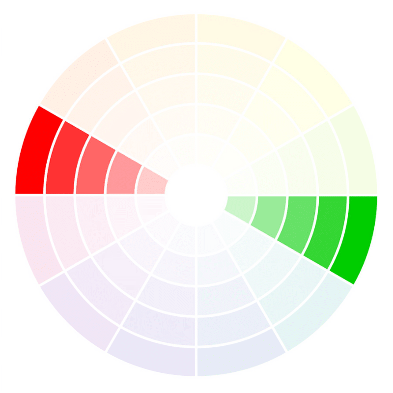
Opposite Colors
energetic

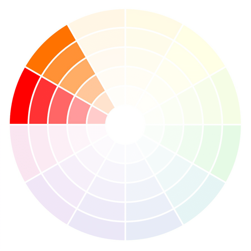
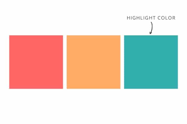
Similar Colors
harmonious

3. Which colors are already culturally associated with your product or industry?
Sometimes it's best to choose a shade of this commonly recognized color because it catches the eye of people who are looking for what you offer. For instance, if you're in the organic skin care industry, you might want to stick with a shade of green in your color palette. This isn't a must, but just something to consider.
Step 3: Pick Your Highlight Color
Your third color is special. This is a color you'll want to use sparingly in order to highlight action items. It's the color you'll sprinkle throughout your website on links and buttons in order to grab attention and entice people to click.
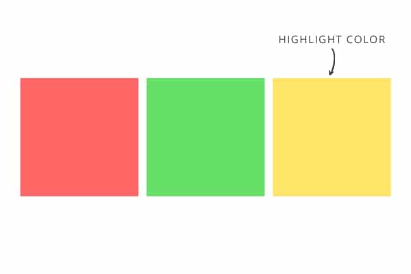
The easiest way to choose a highlight color that stands out is to pick a color on the opposite side of the color wheel from your original two colors.
Let's use the two color palette examples we used above for the opposite colors and similar colors. Here they are below, along with a highlight color you might choose for each.
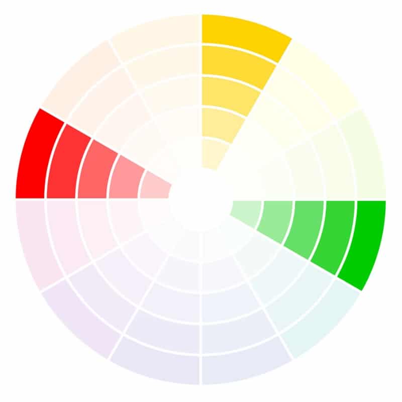
Opposite Colors
energetic
Similar Colors
harmonious
PRO TIP: Need more help? WSS members get free access to an entire library filled with designer-curated color palettes. So you can save time and assure your brand colors look polished and professional. Take a look at all the value-packed resources included in our membership, strategically designed for wellness business owners.

